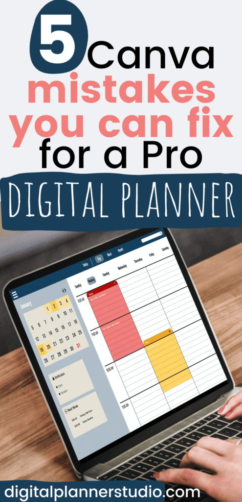
5 Canva Mistakes You Can Fix for a Pro Digital Planner (quick fixes)
Have you ever opened Canva with the best intentions, then sat there thinking, now what? I’ve been there, friend. My first digital planner looked like a jumbled scrapbook, and I spent three hours trying to link one tab. I almost quit, but I felt led to try again.
Here’s why fixing a few simple mistakes matters. You save time, you build confidence, and you start creating tools that actually organize your life. If you want to sell in your own shop or on Etsy, clean design and working links help buyers trust you.
I use these fixes in my own planners, and they changed everything. Less confusion, more peace. More sales too, because people can see and feel the quality.
In this post, you’ll spot the five common Canva mistakes that make a digital planner look unfinished, then learn quick fixes. We’ll talk messy fonts, color overload, missing hyperlinks, cluttered layouts, and wrong export settings. By the end, you’ll know exactly what to do next.
Mistake 1: Overloading Your Planner with Too Many Fonts
If your planner starts to feel busy and loud, it is probably the fonts. I’ve had pages that looked more like a ransom note than a planner.
Too many styles fighting for attention, and nothing felt calm. When I simplified my font choices, my planners breathed. Yours will too.
Clean fonts help your tabs, dates, and notes stand out. They also support your bigger goals, like running a shop with confidence and blessing your buyers with something that feels peaceful to use.
How to Choose and Stick to Just the Right Fonts for a Clean Look
Pick two fonts and commit. One for reading, one for accents. That simple boundary keeps your layout calm and easy on the eyes.
Follow these steps:
- Choose your body font first
- Pick a clear sans-serif for all body text. Good options: Arial, Open Sans, Montserrat, or Josefin Sans.
- Start body text at 12 to 14 pt. If you are over 50, begin at 14 pt. Your eyes will thank you.
- Use regular weight for paragraphs and bold for emphasis only.
- Add one accent font for headings only
- Choose a gentle script or decorative font for titles, section labels, or month names.
- Keep it big enough to read at a glance. Aim for 18 to 24 pt or higher.
- Use it sparingly so your planner stays calm and consistent.
- Test readability where it matters
- Export a test page from Canva as PDF, then open it in GoodNotes on your iPad.
- Zoom in and out. Check small labels, tab names, and calendar dates.
- If you squint, increase size or choose a heavier weight. Thin or wispy fonts fade fast on screens.
- Use pairing tools to stay consistent
- In Canva, try the Font Combinations suggestions to see balanced pairs.
- Browse Google Fonts for free, readable sets. Download a sample page and compare at small sizes.
- Save your choices in Canva’s Brand Hub so you do not drift into font chaos mid-project.
- Set spacing for comfort
- Line spacing: try 1.2 to 1.4 for lists and notes.
- Letter spacing: keep it close to default. Nudge up slightly for all caps headings.
- High contrast helps. Dark text on a light background is best for daily use.
- Make a simple font rule card
- Body: Open Sans Regular, 14 pt, dark gray or black.
- Headings: A soft script like Playlist Script or a bold display like Lovelo, 22 pt.
- Notes: Body font italic only if needed. No third font.
- Do a quick “squiggle check”
- If a fancy script turns into squiggles at calendar size, send it packing. I once tried a curly font for weekdays and ended up reading tea leaves. Cute in theory, unreadable in practice.
- Give your pages breathing room
- Fewer fonts create visual rest. Your eyes glide from section to section, and your design feels intentional.
- This one change makes your spreads look professional without extra effort.
A few helpful examples:
- Body + Accent: Open Sans (body) with a gentle script for headings.
- Minimal pair: Montserrat Light (headings) with Montserrat Regular (body) for a clean, modern look.
- Classic contrast: DM Serif Display (headings) with Rumba or a simple sans (body) if you prefer a slight serif feel.
Quick reminders:
- Use two fonts across the entire planner. Three only if you have a clear reason.
- Avoid super thin, ultra light, or overly curly fonts for body text.
- Test on an iPad, not just your computer screen.
You are building something that helps people feel calm and focused. Keep your fonts simple, readable, and steady. That small act brings order, and it shows care.
Mistake 2: Ignoring Alignment and Grids in Your Digital Planner Design
Have you ever looked at a page you made and felt a little dizzy? I have. My boxes floated, headers leaned, and nothing lined up.
I prayed for patience, then remembered this simple truth: your eyes crave order. Your buyers’ eyes do too.
Clean alignment makes your planner feel calm and reliable. It saves you time, removes guesswork, and helps people read without strain on a tablet.
When your lines, tabs, and dates sit in tidy rows, your whole shop looks more professional.
Easy Steps to Align Everything Perfectly Using Canva’s Tools
Start with a test page. One blank spread. Practice here before you touch your real planner. You will move faster and make fewer fixes later.
Follow these quick steps to dial in precise alignment:
- Turn on your visual helpers
- Go to File, select Show rulers and guides.
- Drag guides from the rulers to mark margins, columns, and tab positions.
- Use the shortcut Shift + R to toggle rulers quickly while you work.
- Build a simple guide system once
- Set top and bottom margins so nothing crowds the edge.
- Add vertical guides for columns, like a 6-column grid for weekly spreads.
- Place a horizontal guide for titles so every page header sits on the same line.
- Snap, do not measure
- Keep Snap to guides on so elements “lock” into place as you drag.
- Nudge with arrow keys for tiny adjustments. Hold Shift for larger jumps.
- Trust the pink alignment lines. They help you center and match spacing fast.
- Align and distribute in one move
- Select multiple elements, then open Position.
- Use Align left, Center, or Align top so edges match perfectly.
- Hit Distribute to even out spacing without measuring gaps. Great for checklists and habit trackers.
- Group for batch accuracy
- Select related items and click Group. Now you can align whole sections at once.
- Example: group “weekday labels + date circles,” then center the group on your column.
- When done, Ungroup if you need to tweak a single label.
- Clone aligned elements, not messy ones
- Get one box, tab, or date label perfect, then Duplicate it across your page.
- Change the text, not the position. This keeps spacing steady and saves time.
- Use “Position” on page-level objects
- For headers or page numbers, select the object and choose Position > Center or Middle.
- This is the fastest way to keep recurring elements uniform across pages.
- Check on a tablet for eye comfort
- Export a test PDF and open it in GoodNotes or your favorite app.
- Zoom in. Look at line spacing and tab alignment.
- If your eyes bounce around, tighten spacing with Distribute or add another guide.
A few time-saving habits I use daily:
- Template guides: Create a master page with your guides and rulers set. Duplicate it for every new spread.
- Consistent gaps: Pick a gap size once, like 16 px, and stick to it with Distribute.
- One anchor element: Align everything to one trusted item, like your header or first column.
- End with a sweep: Select all, then run a final Position > Tidy up pass before export.
Why this matters for you and your buyers: consistent alignment reduces eye strain, especially on iPads, and it makes your planner easier to navigate. Calm design builds trust. And trust helps your shop grow.
Take a breath, friend. You can do this. Set your guides, snap with confidence, and let your layout serve the purpose you feel called to build.

Mistake 3: Relying on Blurry or Low-Quality Images and Graphics
Nothing ruins a beautiful planner faster than fuzzy images. You can have perfect fonts and tidy grids, but if your icons, photos, or stickers look soft, your buyer will notice.
I learned this the hard way when I exported a planner at midnight and saw the tabs turn mushy on my iPad. I almost cried, then I prayed, took a breath, and fixed it.
You do not need fancy tools. You need the right file types, clear sources, and a simple habit of checking your work at full size. Clean graphics bring peace to the page and trust to your shop.
Sourcing and Using High-Resolution Elements to Elevate Your Design
Your goal is simple. Use graphics that stay sharp at the size you need. Here is how to do that without guesswork.
- Use vectors for anything that might scale
- In Canva’s Elements, search your keyword, then filter for graphics that are vectors or labeled as SVG. Vectors scale without blur, which makes them perfect for icons, shapes, and simple illustrations.
- Example: search “leaf line art” or “minimal florals,” then choose a vector version. You can recolor it to match your palette.
- Upload crisp personal files
- Export or save your own graphics as PNG at 300 DPI before you upload to Canva. This keeps stickers, tabs, and labels looking clean on retina screens.
- Avoid resizing up from a small original. If a sticker is 600 px wide and you stretch it to 1400 px, it will look soft.
- Start with large source images
- Photos should be at least 2000 px on the shortest side for planner pages. Bigger is better, because you can size down without losing quality.
- For full-page backgrounds, aim for around 2732 x 2048 px to cover large iPad screens without blur.
- Grab free high-quality assets from trusted sites
- For photos: Unsplash and Pexels have beautiful, large images that look clean in spreads and covers.
- For icons and simple graphics: Pixabay offers PNGs and vectors for quick, sharp accents.
- Tip: download the largest size available, then size down in Canva. Never size up.
- Choose graphics that match mature tastes
- Keep it simple and elegant. Try soft florals, minimal line art, or gentle geometric patterns.
- Use 1 to 2 styles across your planner so it feels cohesive and calm. A little restraint goes a long way.
- Check clarity before you publish
- Zoom to 100 percent in Canva and scan key areas. Tabs, icons, calendar numbers, and stickers should look crisp. If it looks fuzzy at 100 percent, it will not get better in GoodNotes.
- Export a single test page as PDF and open it on your iPad. Do a quick “pinch and check” on tabs and small labels. Adjust if needed.
- Organize assets so future projects move faster
- Create Canva folders like “Vectors,” “Photos,” “Stickers 300 DPI,” and “Covers.” Add a folder for your brand colors or seasonal sets.
- Rename files with details that help you later, like “soft-floral-vector-rose” or “tab-sticker-300DPI-nude-01.”
- Save your favorite sources in a note: Unsplash for covers, Pixabay for icons. This small habit saves hours and keeps your style consistent.
- A simple quality checklist I use on every planner
- Icons are vectors or large PNGs at 300 DPI.
- Photos are 2000 px or larger on the short side.
- Nothing is stretched beyond its original size.
- Preview at 100 percent in Canva, then test in GoodNotes.
- Assets saved in folders for quick reuse.
Friend, this is where your planner starts to look premium. Clean lines, no fuzz, and a look that says you care. I still whisper a quick prayer over export days, but with these steps, I rest easy. You can too.
Join Our Newsletter and Get a FREE Mini Digital Planner Creation Kit
It comes with Canva template, video tutorials, and 50 planners you can create – no matter your niche.
Mistake 4: Crowding Every Inch and Forgetting White Space
Have you ever finished a spread, zoomed out, and felt your chest tighten a little? I have. I kept adding boxes, stickers, and labels until my page looked busy. I wanted it to feel helpful, but it felt loud.
When I paused, took a deep breath, and started honoring white space, my planners finally felt calm and premium. Yours will too.
White space is not wasted space. It is rest for the eyes, a gift to your buyer, and a smart design choice. It makes your pages easier to read, easier to write on, and easier to sell. Think of it like the margins in a book or the quiet between notes in a song. That quiet is where focus lives.
Creating Balance with Smart Use of White Space in Canva
You do not need to rebuild your layout. You need to give it room to breathe and guide the eye. Try these simple steps after you place your elements.
- Space elements evenly with Canva’s Position tools
- Select a group of boxes, labels, or icons.
- Open Position, then use the spacing options to create even gaps.
- Aim for 10 to 20 px between items for a clean, readable rhythm.
- Keep one gap size across the page so everything feels consistent.
- Add padding inside text boxes
- Increase padding so text does not kiss the edges.
- This small shift improves readability and makes your planner look high-end.
- Set quiet margins around the page
- Leave a consistent border around your spread.
- Avoid putting text or icons right on the edge. Your page will feel calmer with a little breathing room.
- Do a zoom-out clarity check
- Zoom out to 25 to 50 percent and scan the page.
- If your eye jumps around or you feel crowded, remove something.
- Use the “minus 20 percent rule.” Delete about 20 percent of elements on a crowded page. Keep only what serves the user.
- Edit backgrounds for calm
- Choose backgrounds with open areas so text can sit on quiet space.
- If a pattern feels busy, lower the opacity or size it down.
- Keep your background secondary. Your content should lead.
- Build hierarchy with space, not just size
- Give titles more breathing room above and below.
- Cluster related items close together, then add larger gaps between sections. This creates natural sections without extra lines.
- Try a minimalist monthly view
- Use a clean grid with thin lines, simple day labels, and soft accents.
- Keep icons small. Let the dates and boxes be the heroes.
- A minimalist monthly spread feels modern, printable, and easy to write on in GoodNotes.
- Embrace asymmetric layouts for interest
- Balance does not have to be perfectly centered.
- Example: place a slim sidebar for priorities on the left, then keep the main schedule area open and roomy on the right.
- Use one strong focal point and let the rest stay simple.
- Remove borders and visuals that do not add value
- If a line or sticker does not help someone plan, take it out.
- Use fewer shapes. Use clearer spacing. Let the content speak.
- Test for real use
- Export one page as a PDF and open it in GoodNotes.
- Write a few notes with your Apple Pencil. Is there enough room to write? Do headings breathe? Adjust spacing if your handwriting feels cramped.
A few design ideas you can apply right away:
- “Minimalist monthly views”: thin grid, generous margins, simple headers.
- Calm weekly dashboard: one focal quote or verse at the top, then open task areas with clear gaps.
- Notes-heavy layouts: fewer boxes, more blank space, subtle dotted backgrounds for writing.
Helpful reminders as you refine:
- White space invites personalization. Your buyer will add stickers, notes, and highlights in GoodNotes. Leave room for their life.
- Less is kinder. A clear spread reduces eye strain and decision fatigue.
- Consistency wins. Pick a standard gap size for this planner and use it everywhere.
Quick checklist before you export:
- Gaps between items sit at 10 to 20 px.
- Text boxes have visible padding.
- Margins look even around the page.
- You removed at least one extra element per section.
- Backgrounds stay quiet behind text.
- Spreads feel open at 50 percent zoom and readable at 100 percent.
You are not “leaving space.” You are creating peace. Trust the quiet. Your buyer will feel it, and your shop will show it.
Mistake 5: Picking Fonts That Are Too Fancy or Hard to Read
Let me be honest. I once used a curly script for all my weekday labels. Cute on my laptop, squiggles on my iPad. I laughed, then sighed, then fixed it.
If your planner feels “pretty but hard to use,” it is probably the fonts. You can keep your style and still make every word easy to read.
Readable fonts save your eyes, help your buyers trust you, and cut support questions. Simple letters, clear spacing, and steady contrast make your planner feel peaceful and premium.
Selecting Legible Fonts That Still Add Style to Your Planner
You do not have to pick boring fonts to get clarity. You just need a calm base and a gentle accent that works at small sizes.
- Start with a clean body font
- Try Montserrat for body text. It has open shapes, steady weight, and clear numbers for dates.
- Keep weights in the Regular to Medium range. Extra thin styles disappear on screens.
- Size for comfort. If you are over 50, start at 14 pt for body text.
- Add style with a subtle accent
- Use Playfair Display for titles or section labels. Elegant, high-contrast, and easy to spot.
- Keep the accent font for headings only. Your body text should stay in Montserrat or another sans.
- Pairing rule: one steady sans, one classy serif. That is it.
- Skip all-caps for paragraphs
- All-caps makes long text feel loud and tiring.
- For emphasis, use bold or italics. Keep it short, like a phrase or a label.
- Test the real way buyers use it
- Export one page as a PDF and open it on your iPad or tablet.
- Zoom out to fit the page. Can you read month names and tab labels without pinching in?
- Print a single page at 100 percent. If text looks gray or thin, increase weight or size.
- Read the page out loud. If you stumble or squint, the font is working against you.
- Use Canva’s accessibility help if you have it
- In Canva, look for the accessibility checker in the File menu. It flags small text and low contrast so your pages stay readable.
- If you do not see that option, use this quick check instead:
- Contrast: dark text on a light background, or light on dark.
- Size: 12 pt minimum for body text, 14 pt if your eyes get tired.
- Touch targets: labels near tappable areas should be bold or slightly larger.
- Match fonts to your planner’s theme
- Journals or reflection planners: a serif accent like Playfair Display for warmth, paired with a calm sans for body text.
- Quick day planners or business planners: a sans duo like Montserrat for both headings and body, using weight and size to create hierarchy.
- Faith or gratitude planners: a light, readable script only for short titles, then keep all notes and verses in a clean sans.
- Small tweaks that boost clarity fast
- Increase letter spacing slightly for small labels and tabs.
- Use bold for table headers, not extra-thin styles.
- Avoid decorative scripts for dates, weekdays, or tiny stickers. They blur at calendar size.
- Keep color contrast strong. Soft gray on beige sounds nice, but it can be hard to see on a tablet.
Here is a simple pairing that works across most planners:
- Body text: Montserrat Regular at 14 pt
- Headings: Playfair Display at 22 to 28 pt
- Emphasis: Montserrat Bold for subheads or key labels
- Numbers and dates: Montserrat Medium for a bit more weight
A quick style check I use before export:
- No all-caps in body text.
- Only two fonts across the spread.
- Heading sizes jump clearly from body text.
- Tabs and calendar labels are readable at a glance.
- A single test page passes the iPad and print check.
You can keep your flair and still make reading effortless. Choose calm fonts, sprinkle in style with care, and test like your buyer would. Your planner will feel clear, kind, and ready for real life.
Join Our Newsletter and Get a FREE Mini Digital Planner Creation Kit.
Join Our Newsletter and Get a FREE Mini Digital Planner Creation Kit
What’s Next?
You just walked through the simple fixes that turn a Canva digital planner from “almost there” into a clean, confident product.
When you avoid clutter, pick readable fonts, honor white space, use crisp graphics, and keep alignment tight, your pages feel calm and professional.
That shift moves you from amateur to expert, and it keeps your side hustle steady without overwhelm.
You want an organized life, a shop that is fun to run, and tools worth sharing. You can have that. I have seen my own shop grow from fixing these exact issues, and I’m so thankful for the clarity that came with practice.
Grab your next step: download the free Canva planner templates from Digital Planner Studio, share your biggest takeaway in the comments, or pin this for later. Keep going, friend. Your planner can bless people and build your business.
Please pin one of the images below to your favorite organizational or planning board: